skydesign.news Logo announcement

  • Status: Closed
  • Prize: $250
  • Entries Received: 344
  • Winner: daudhasan

Contest Brief

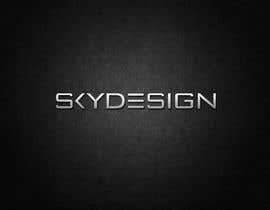
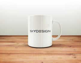
Skydesign logo tender

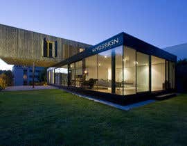
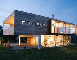
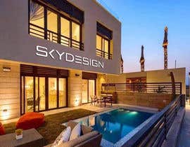
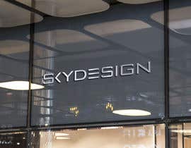
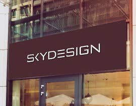
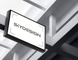
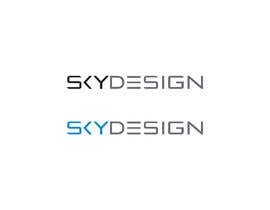
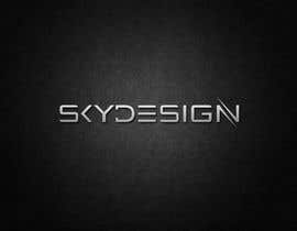
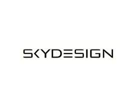
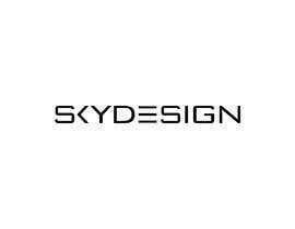
We need a new logo for the privacy screens www.skydesign.news. On http://www.skydesign.news you can see the existing logo. It should be in this direction. Straight lines that match this product.

Requirement:

Straight lines and fonts

Optics: Similar to the existing logo

With and without www

With and without .news

With and without signature: privacy screen room divider
(That means there might be an addition under the logo, but not always used.)

Colors: if possible only 1 to 2 colors. (Unless someone has a better idea.
The logo should be a graphical solution, which makes the logo unique. (less is more) Something you can not solve with just one typeface.

The logo should be readable at a width of about 1cm.

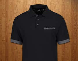
If possible, the logo should be visualized on a polo shirt or umbrella.

Our logo should also be usable if it is to be engraved into an object.

More information on http://www.room-divider.net

Our privacy screen room divider screen is marketed worldwide. So your work can be used very well as a reference. This is also a very important decision for your Future Customers.

best regards
Julia
Marketing Director

This text was translated from German into English using Google Translation. Please understand if not everything is legible.

Recommended Skills

Employer Feedback

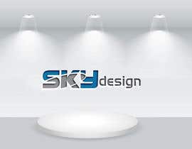
“A very good cooperation! Everything was 100% fulfilled! We can definitely recommend this graphic artist! Our logo Skydesign News is very well received!”

Profile image logoboerse, Austria.

Top entries from this contest

View More Entries

Public Clarification Board

  • RAZIBMONDAL
    RAZIBMONDAL
    • 5 years ago

    #819

    • 5 years ago
    1. RAZIBMONDAL
      RAZIBMONDAL
      • 5 years ago

      ohh, sorry. already taken.

      • 5 years ago
  • mn2492764
    mn2492764
    • 5 years ago

    #775


    |


    feedback please

    • 5 years ago
  • deepakmanju
    deepakmanju
    • 5 years ago

    please #754 #755 #756 #757

    • 5 years ago
  • mr180553
    mr180553
    • 5 years ago

    please check #741 #742 #743

    • 5 years ago
  • sopnelsagor
    sopnelsagor
    • 5 years ago

    Check #707, #708, #709 ... . .. . .

    • 5 years ago
  • deepakmanju
    deepakmanju
    • 5 years ago

    feedback please #689 #691 #692 #693

    • 5 years ago
  • RAZIBMONDAL
    RAZIBMONDAL
    • 5 years ago

    #677 thanks

    • 5 years ago
  • deepakmanju
    deepakmanju
    • 5 years ago

    please feedback #665 #666

    • 5 years ago
  • logoexpertbd
    logoexpertbd
    • 5 years ago

    pLEASE CHECK #662 #664

    • 5 years ago
  • deepakmanju
    deepakmanju
    • 5 years ago

    please feedback #660 #661

    • 5 years ago
  • deepakmanju
    deepakmanju
    • 5 years ago

    please rate #645 #646

    • 5 years ago
  • deepakmanju
    deepakmanju
    • 5 years ago

    please feedback #639 #640 #641 #642 #643

    • 5 years ago
  • deepakmanju
    deepakmanju
    • 5 years ago

    please #633 #634 #635 #636

    • 5 years ago
  • deepakmanju
    deepakmanju
    • 5 years ago

    please feedback #627 #628 #629

    • 5 years ago
  • deepakmanju
    deepakmanju
    • 5 years ago

    please feedback #625

    • 5 years ago
  • deepakmanju
    deepakmanju
    • 5 years ago

    please feedback #612 #613

    • 5 years ago
  • logoboerse
    Contest Holder
    • 5 years ago

    Thank you for your design! It is not 100% what we want, but very nice! Can you also show the design in one color and two colors? The letters are best all tall. Maybe you should change something in the writing. With our logo we appeal to many architects who like it when everything is very straightforward. We have to engrave the logo in wood or plastic. Therefore, it must be so that the letters are not too thick and not too tight together. Presumably we will use the logo in the future only with one color. Then the color Nirosta would have stainless steel look. Since we want to convey a very upscale impression. I appreciate your further ideas and suggestions. Additional info: The logo should not be associated with the room divider. The logo should stand for everything. We may still be launching polo shirts, cell phones, or other products.

    • 5 years ago
    1. AdrianActitud
      AdrianActitud
      • 5 years ago

      Hello, following your idea a bit I designed this logo to represent your company. A minimalist logo, attractive, modern, simple, professional, original, different, creative and easy to use and recognize.
      I hope you like it, I am open to suggestions.
      Please do not forget to leave me your comments and stars. Check #610

      • 5 years ago
  • rahuldhrubork
    rahuldhrubork
    • 5 years ago

    please check all my entries & let me know for any modification. we are very open to modification and your suggestion. thanks!

    • 5 years ago
  • minachanda149
    minachanda149
    • 5 years ago

    Entry #579 of 579 check #56 update

    • 5 years ago
  • minachanda149
    minachanda149
    • 5 years ago

    #56 please feedback .Thanks

    • 5 years ago
  • minachanda149
    minachanda149
    • 5 years ago

    #362 mem any change ?

    • 5 years ago
  • daudhasan
    daudhasan
    • 5 years ago

    please check #576

    • 5 years ago
  • mn2492764
    mn2492764
    • 5 years ago

    have a look #572

    • 5 years ago
  • daudhasan
    daudhasan
    • 5 years ago

    please check #570

    • 5 years ago
  • Srbenda88
    Srbenda88
    • 5 years ago

    Dear , please have a look at #546. Thank you.

    • 5 years ago
  • deepakmanju
    deepakmanju
    • 5 years ago

    pleas rate #492 #493 #494 #495 #496

    • 5 years ago
  • deepakmanju
    deepakmanju
    • 5 years ago

    plz rate #452

    • 5 years ago
  • deepakmanju
    deepakmanju
    • 5 years ago

    please check #439 #440

    • 5 years ago
  • logoboerse
    Contest Holder
    • 5 years ago

    Whether large letters, or small letters, it just has to look noble. Everything should be very straightforward and yet have the same momentum. Fat or thin? The logo should be to fall in love. One should not be fed up. It should give love at first sight. Can you do that?

    • 5 years ago
    1. faisalaszhari87
      faisalaszhari87
      • 5 years ago

      Yes. I can

      • 5 years ago
    2. sengadir123
      sengadir123
      • 5 years ago

      please check entry #430 , #434, #435, #437, #438

      • 5 years ago
  • markmael
    markmael
    • 5 years ago

    #431 thanks

    • 5 years ago
  • deepakmanju
    deepakmanju
    • 5 years ago

    please check #427 #428 #429

    • 5 years ago
  • deepakmanju
    deepakmanju
    • 5 years ago

    please check #418 #419 #420 #421 #423 #424

    • 5 years ago
  • kanchanverma2488
    kanchanverma2488
    • 5 years ago

    PLEASE #407 #408 #409 #410 #411

    • 5 years ago
  • markmael
    markmael
    • 5 years ago

    #406 thanks

    • 5 years ago
  • kanchanverma2488
    kanchanverma2488
    • 5 years ago

    please #373 #374 #375 #376 #377 #378

    • 5 years ago
    1. logoboerse
      Contest Holder
      • 5 years ago

      You make very nice logos! Can you please try to make a logo only with the font? No extra artwork, just the script SKYDESIGN or SKYDESIGN.news - Less is more. Straight lines, but very noble! Little curves. You have to see the logo and be able to say, that's the most beautiful logo ever. Do you want to try this?

      We can not do anything with the addition.

      Sample: https://www.linzag.at/media/bilder/assets/logo/OpenGraphLINZAG_ogImageHigh.jpg
      https://www.linzag.at/media/bilder/presse/linz_ag_2/enamo-logo_newsImage.jpg

      best regards
      www.skydesign.news

      • 5 years ago
  • logoboerse
    Contest Holder
    • 5 years ago

    You make very nice logos! Can you please try to make a logo only with the font? No extra artwork, just the script SKYDESIGN or SKYDESIGN.news - Less is more. Straight lines, but very noble! Little curves. You have to see the logo and be able to say, that's the most beautiful logo ever. Do you want to try this?

    We can not do anything with the addition.

    Sample: https://www.linzag.at/media/bilder/assets/logo/OpenGraphLINZAG_ogImageHigh.jpg
    https://www.linzag.at/media/bilder/presse/linz_ag_2/enamo-logo_newsImage.jpg

    best regards
    www.skydesign.news

    • 5 years ago
  • mondaluttam
    mondaluttam
    • 5 years ago

    Please check #367

    • 5 years ago
  • minachanda149
    minachanda149
    • 5 years ago

    Entry #362 of 362

    • 5 years ago
  • dulhanindi
    dulhanindi
    • 5 years ago

    please check #343

    • 5 years ago
  • kanchanverma2488
    kanchanverma2488
    • 5 years ago

    PLEASE #329 #330 #331 #332 #333 #334 #335

    • 5 years ago
  • deepakmanju
    deepakmanju
    • 5 years ago

    please check #306 #307 #308 #309 #310

    • 5 years ago
  • kanchanverma2488
    kanchanverma2488
    • 5 years ago

    PLEASE #300 #301 #302 #303 #304 #305

    • 5 years ago
  • minachanda149
    minachanda149
    • 5 years ago

    #299 #298

    • 5 years ago
  • kanchanverma2488
    kanchanverma2488
    • 5 years ago

    PLEASE #288 #289 #290 #291 #292 #293 #294 #295

    • 5 years ago
  • kanchanverma2488
    kanchanverma2488
    • 5 years ago

    PLEASE #278 #279 #280 #281 #282 #283 #284

    • 5 years ago

Show more comments

How to get started with contests

  • Post your contest

    Post Your Contest Quick and easy

  • Get tons of entries

    Get Tons of Entries From around the world

  • Award the best entry

    Award the best entry Download the files - Easy!

Post a Contest Now or Join us Today!