Photoshop Design for Judgee
- Status: Closed
- Prize: $290
- Entries Received: 6
- Winner: velare

Contest Brief
a Facebook-Twitter lookalike for lawyers
Recommended Skills
Public Clarification Board
-

Contest Holder - 11 years ago
I'm so sorry that out of 6 days, only the last one I started receiving entries that met my requirements. A lot of people posted images that didn't meet either one single requirement that I posted on the brief.
I wish to thank everybody for partecipating, I appreciated some of the work and I will contact some of you to check if I can hire you.
Thanks again to everybody, wish the best for you all.
GRJud- 11 years ago
View 1 more message
-

ivanoilmagno
- 11 years ago
Hi I did not reach the time to post my design Here it is:
http://www.indaxone.com/judgee.jpg
If you like it I can continue with the development of the site.
Thanks- 11 years ago
-

roberteditor
- 11 years ago
dear contest holder.. you give me 3 star,,,, but u rejected my design.....i think my design is not good...
- 11 years ago
-
roberteditor
- 11 years ago
dear contest holder.. you give me 3 star,,,, but u rejected my design.....i think my design is not good...
- 11 years ago
-
ivanoilmagno
- 11 years ago
Hi did you receive my entry? i just uploaded it.Thanks
- 11 years ago
-

Time4AChange
- 11 years ago
Please Check #132 and #133 hope you like it. they are nice and professional. Thanks !
- 11 years ago
-

kalderon
- 11 years ago
#126
- 11 years ago
-

kreativegraphic
- 11 years ago
working on so please wait for my design!!!Thanks!!!
- 11 years ago
-

manuelberja
- 11 years ago
Comment for my entry #113 and #114 is highly appreciated. thanks!
- 11 years ago
-

amodsachintha
- 11 years ago
hello, please rate #111 and comment.. love to hear feedback..
- 11 years ago
-

thusyanthy
- 11 years ago
please check #109
- 11 years ago
-

Pavithranmm
- 11 years ago
Hi I am interested to do this...if I submit within 8 hours any chance? or did you already choose a winner? Thanks
- 11 years ago
-

yeaho00
- 11 years ago
#91 Please Check
- 11 years ago
-

basharruben
- 11 years ago
please check #90
- 11 years ago
-

farrukhz222
- 11 years ago
Please chk entries! Thanks
- 11 years ago
-

predelam
- 11 years ago
It does not make me upload an entry
- 11 years ago
-
basharruben
- 11 years ago
Please Check #80 ...Thanks
- 11 years ago
-
farrukhz222
- 11 years ago
plz chk #77, #78, #79! thks
- 11 years ago
-
cnatural87
- 11 years ago
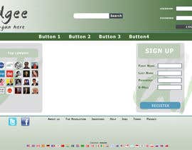
Hi, submitting #76 I decided to go with more of an Instagram approach and give the logo a more professional look and feel. With the idea of a social network built for lawyers in mind, I felt like it deserved something more mature and elegant. The colors kind of represent currency with (Money/Gold) I can put together a template of what the site can look like if you like this design... Would love to here feedback! #76
- 11 years ago
-

SmartMen
- 11 years ago
Hi, CH.. I've made a revision of my previous design (homepage) depend on the image you shared (twitter), and make the menu drop to down there. I also provide you the example of the logo.
And beside graphic design, I also can master the Web Developing (HTML, CSS, PHP, JS), please look at the website I've made for http://999skins.com/. I designed and also developed by myself (It still under construction, but has been finished 80% and you can visited it).
Hope I can also help you to design your own website and develpo it. :)
That's all, thanks
Cheers, rioDesign- 11 years ago
-
SmartMen
- 11 years ago
please check and I need your feedback for #67
- 11 years ago
-

anbuselvammercy
- 11 years ago
pls check #66
- 11 years ago
-

acutegroups
- 11 years ago
check 64 & 65 also
- 11 years ago
-
acutegroups
- 11 years ago
check 59.60,61,62,&63
- 11 years ago
-

marcgreenberg
- 11 years ago
I just added my entries for website, #55, #56 and #57. I can quickly do variations on the theme if there are some elements about them you like and others you'd like to change. The works pull inspiration from Facebook, Twitter, and LinkedIn
- 11 years ago
-

Wyeoh
- 11 years ago
Hello grJud, please check my revised proposal.
I have updated the green, please let me know if this is good, or if you want it to be brighter/darker.
The menu has updated to flow horizontally, let me know if you want to try another color or style on it.
Please give me your opinion on the overall layout and color scheme, I will try to revise it to the site that you envision.
Thanks a lot.- 11 years ago
-
acutegroups
- 11 years ago
check 41 and 42
- 11 years ago
-

ravindersingh92
- 11 years ago
Sir please Check My design #38
- 11 years ago
-
SmartMen
- 11 years ago
why the icons get a better score/rating than the home page design entries ?
- 11 years ago
-
Contest Holder - 11 years ago
Actually you are right, but that's because I immagine the icon style on the left of an homepage.
But don't worry, it will surely win a Homepage- 11 years ago
-
Nemesismj
- 11 years ago
please check #37 and give a comment...
- 11 years ago
-
Nemesismj
- 11 years ago
please check #36 and give a comment...
- 11 years ago
-
Wyeoh
- 11 years ago
Howdy, I am Wyeoh - a web designer and programmer. I am here to help you create a professional looking homepage for your judgee site.
First of all, I am unsure if you want the homepage to be the page before the user is logged in or after logged in. I have designed the logged in version.
I've selected dark medium elegant green color as the header, and the colors of middle and footer section are chosen to give the site an overall solid and professional feel. The logo on the proposal is just a placeholder, if you wish, I can help you design the logo as a follow up project. I am a web developer too so I will be able to help you code or give you advise on building the site.
Please check out my proposal and let me know your opinion, I will work with you to polish the design so that it meets your needs before the contest is over.
Thank you.- 11 years ago
-
Wyeoh
- 11 years ago
Thanks for your feedback. I would like you to clarify on a few of the following points so I can fully understand and deliver the layout you are expecting.
1. Should the homepage be before the user is logged in?
2. You mentioned about color change, is it for the header, middle section, bottom or all? Is the green color correct? Or please refer me the green you are looking for.
3. What kind of font are you looking for? Isn't the font I chose futuristic? What about the writes?
4. So, you want to keep the page menu horizontally under the header like the twitter example?
Please clarify on these points and I will work on a revised draft. Thanks a lot!- 11 years ago
-
Contest Holder - 11 years ago
1. No it's where they log in
2. Right colors and gradient is what matters to me, check out trip advisor for the green
3. I'm not an expert in fonts, try writing "Judgee" with different ones, I'll choose it
4. Yes
Hope it helps.- 11 years ago
-
Contest Holder - 11 years ago
I see that when you think about lawyers you guys think about "old" and "english" style. It's innovation, so I'd rather kind of Elegant FUTURISTIC. Please check out this image and work to change it. thanks
http://www.clickonf5.org/wp-content/uploads/2010/03/twitter_new_homepage_thumb.jpg- 11 years ago
-
SmartMen
- 11 years ago
ok, wait for my entry grJud.
- 11 years ago
-
roberteditor
- 11 years ago
@ 16# its your original work....
- 11 years ago
-

sharaa10
- 11 years ago
check #29 please thanks- sharaa10 Cheer-up!!!
- 11 years ago
-
dhennydochi
- 11 years ago
please check #27
- 11 years ago
-
SmartMen
- 11 years ago
Hi, CH.. I've read your brief, and #24 this is my entry.
Include Header, Body (2 columns) and Footer.
Any suggestions to make it better ?
Thanks- 11 years ago
-
acutegroups
- 11 years ago
please check #15
- 11 years ago
-
acutegroups
- 11 years ago
when we upload the file #8 & #10 .It showing in some other colour.But we design in MEDIUM DARK GREEN.so you please download from this link.https://www.dropbox.com/s/t39okjblwh19q6c/Judgee.jpg
- 11 years ago
-

imaginationz
- 11 years ago
plz chk #7 & #9 also & give feedback ................thanks,
- 11 years ago
-
imaginationz
- 11 years ago
plz chk entry #6 & give comments ............. thanks,
- 11 years ago
-
roberteditor
- 11 years ago
please tare nUmber 1 to 5
- 11 years ago
-
Contest Holder - 11 years ago
Robert, I like the idea of the hammer but I asked for a totally different thing. Read everything please, I said the logo was not very important, I NEED A HOMEPAGE PROPOSAL. I said I'd prefer it MEDIUM DARK GREEN. Please read everything about the contest. Apply yourself because I like the idea of the hammer turning into a J, I didn't think about it.
- 11 years ago
-

EzaiLX
- 11 years ago
do you have a logo we could incorporate? or do we have to come up with our own?
- 11 years ago
-
Contest Holder - 11 years ago
come up with a simple one. Logo is not very important, the most important is to choose right colors.
- 11 years ago
-

bogdanbaractaru
- 11 years ago
i need a resolution
- 11 years ago
How to get started with contests
-

Post Your Contest Quick and easy
-

Get Tons of Entries From around the world
-

Award the best entry Download the files - Easy!