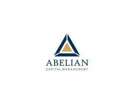
Graphic Design for Abelian Capital Management
- Status: Closed
- Prize: $100
- Entries Received: 78
- Winner: sourav221v

Contest Brief
Computer-driven stock day trading. Exciting, high-tech, and unique. US-based.
Recommended Skills
Employer Feedback
“@sourav221v won the contest on 20 December 2012”
![]() Mathemagician1, United States.
Mathemagician1, United States.
Public Clarification Board
-

logomaster055
- 11 years ago
this is illegal we all should report the winning logo.its being copied so by that way he will not get his money.because sourav221v is doing illegal...so report his winning design...
- 11 years ago
-

faisalkreative
- 11 years ago
My intention was to inform CH that you are not getting original concept. You may face legal action against this logo by the original owner of this logo in future, but he is ok with that. He said in below comments that "My lawyer says it's fine and that's good enough for me". So CH is happy with the logo. Now i don't think we should report the winning logo to block his prize money as client is happy with the logo and as i think he also done the files handover process. But i wish we should report that copycat logos before closing of contest.
- 11 years ago
-

sourav221v
- 11 years ago
I think @BuDesign must be an ex-KGB or NIS agent. Great work! But kindly tell me who created the logo first in these four links that you posted, because it is quite difficult for the CH to find the original creator of the logo and award him / her. I think it is not that much tuff job for you and who knows you will get some reward also.
Dear friends believe me it is nothing but a coincidence may be my logo is looking like some other logos. If you think of letter 'A' mostly everyone think this types of shapes, and if you see my entries you will find how I created this because it is the modified version of #46 , #47 and then #63 comes.
Thanks
SOURAV ?- 11 years ago
-
faisalkreative
- 11 years ago
Yes good answer. but don't you think your logo can create a big damage/loss to the contest holder's company. Its not just about $100. The whole marketing of the company depends on their logo. What you will say if he has to face the legal action or you are just concern about your prize money? Modification doesn't mean you copy other's logo. That is crime. You are a designer, you must be aware of that thing. I am not saying this because he doesn't select my design. If you start thinking that way that i am jealous than you are wrong bro. If you want i will withdraw my all entries. clients doesn't have time to search for logos on internet to check whether its original or not. Its our duty as professionals to give them original work as they expect original artwork from us. Can you imagine the embarrassment he will face when someone say "oh i saw that logo before, did you copy it"??
- 11 years ago
-

BuDesign
- 11 years ago
@faisalkreative That's what I mean. Not for any penalties and of originality. Nothing memorable and distinctive. Choice is the employer but this is my opinion!
@ sourav221v if you resent means that our opinion matters!- 11 years ago
-

CTLav
- 11 years ago
Congrats Sourav 221v& CH
- 11 years ago
-
sourav221v
- 11 years ago
thanks @CTLav and same to you for "junite". :)
- 11 years ago
-
amin90
- 11 years ago
sir please check my logo thanks
- 11 years ago
-

Contest Holder - 11 years ago
In case anyone is curious, this is the Cayley graph for the abelian group C3xC2:
http://www.springerimages.com/Images/HumanitiesArts/1-10.1007_s11245-009-9065-4-3
My lawyer says it's fine and that's good enough for me. Thanks all for watching my back!- 11 years ago
-
amin90
- 11 years ago
thanks
- 11 years ago
-
amin90
- 11 years ago
yes faisal right
- 11 years ago
-
amin90
- 11 years ago
yes sir thanks
- 11 years ago
-
Contest Holder - 11 years ago
This was not an easy decision! Ultimately, the deciding factor was that the winning logo is drawn from a mathematical object (a Cayley diagram of the Abelian group C3xC2) with a tie to the word Abelian and this will serve us well. Thanks to all who entered and congratulations to the winner, sourav221v! We look forward to having the opportunity to work with many of you on future projects!
- 11 years ago
View 1 more message
-
BuDesign
- 11 years ago
http://www.triwayind.com/
- 11 years ago
-
faisalkreative
- 11 years ago
I totally agree with you @BuDesign. "You buy something that cannot actually be yours". That was not original concept but i wish participants inform contest holder about these things before his final decision. This logo was rated 5 stars 3 to 4 days ago but no one noticed that its not original concept. Now the contest holder is responsible if that company takes any legal action against the logo. Anyway "sourav221v" wins the race, congrats :)
- 11 years ago
-

vndesign2011
- 11 years ago
Hi @logomaster055
Your design #244 #245 #246 #247 similar design of @BrandCreativ3 from contest
http://www.freelancer.com/contest/Logo-Design-for-Property-and-Development-Company-11816-byentry-938295.html- 11 years ago
-
faisalkreative
- 11 years ago
Yes. I agree with you. He has copied concepts. CH be aware of that.
- 11 years ago
-
logomaster055
- 11 years ago
He just copied my design. im not coping anyone designs.
- 11 years ago
-
amin90
- 11 years ago
THANKS
- 11 years ago
-
amin90
- 11 years ago
GOOD JOB
- 11 years ago
-
Contest Holder - 11 years ago
We are extremely pleased with the entries! This is not going to be an easy decision at all...
- 11 years ago
-

pandojevito
- 11 years ago
dont know why but a lot of the logos here reminds me this contest... http://www.freelancer.com/contest/Logo-Design-for-Mashinski-Law-Firm-LLC-11773.html
- 11 years ago
-
pandojevito
- 11 years ago
ummm im sorry.. also its the same contest hoder!! weird!!
- 11 years ago
-
Contest Holder - 11 years ago
That would be why! :)
- 11 years ago
-
Contest Holder - 11 years ago
Note: I just found out that rejecting a design costs the designer points. I had no idea this was happening and will only reject designs that either don't follow the contest instructions or are inappropriate. Apologies to those who have been affected!
- 11 years ago
-
BuDesign
- 11 years ago
:)
- 11 years ago
-

apurvatamhane
- 11 years ago
The logos designed above are really great and cool. I hope the person likes one of these! Really good!
- 11 years ago
-
Contest Holder - 11 years ago
We agree, and are very pleased!
- 11 years ago
-
Contest Holder - 11 years ago
We prefer simple, clean designs that will work well in various sizes on screen, in print, and embroidered. We do not like rounded fonts.
- 11 years ago
-
Contest Holder - 11 years ago
Dark blue and gold, please.
- 11 years ago
How to get started with contests
-

Post Your Contest Quick and easy
-

Get Tons of Entries From around the world
-

Award the best entry Download the files - Easy!