Desgin 16 posters

Contest Brief

*PLEASE READ CAREFULLY*

I would like someone to design 16 posters for me. These are motivational quotes in a chalk on blackboard style.

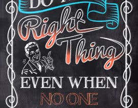
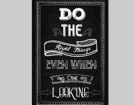
I am attaching some images of what I would like these posters to look like.

I want you to be an art forger for this job. I want you to look at these examples and I want you to take the new quotes I provide and design 16 new posters in EXACTLY the same style as in the examples. The same fonts, the same colour schemes, the same border ideas, the same level of creativity.

I need these posters to look EXACTLY like the examples. I need them to look like they were done by the same artist.

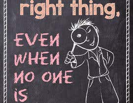
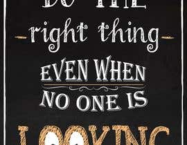
I will provide 1 quote here. Create 1 poster using this quote in the style that you see in the examples. If you can do this, you will get the job to complete all 16 posters. I will pay $200 for 16 posters. In the future, I will have more work for you, probably another 50 posters.

Please DO NOT participate if you cannot reproduce EXACTLY the style, design and creativity of the poster examples you see. Many of the fonts in the examples will not be found in Illustrator as they have been hand drawn. You need to be an artist and be creative but the posters MUST look just like the ones you see.

Once you are chosen for the job, I'd like the 16 posters completed within 5 days, including revisions.

One last note - I am not interested in seeing examples of work you have done in the past. That has no bearing on whether or not you can do this job to my requirements. I need to see what can do with this.

Please let me know if you have any questions. I hope I have been clear about my requirements.

Here is the quote I would like you to use:

Do the right thing, even when no one is looking

Recommended Skills

Employer Feedback

“Oscar did an excellent job with my project. He listened carefully and communication was prompt. He made all of the revisions I requested in a timely fashion. I would absolutely recommend him.”

Profile image blkidd, Canada.

Top entries from this contest

View More Entries

Public Clarification Board

  • blkidd
    Contest Holder
    • 5 years ago

    I want to thank you for your time and effort. All of the submissions were good and creative. I apprecaite your ability and talent.I have selected a winner

    • 5 years ago
  • blkidd
    Contest Holder
    • 5 years ago

    Hello To everyone who submitted an entry into the contest.

    • 5 years ago
  • marktiu66
    marktiu66
    • 5 years ago

    im late.

    • 5 years ago
  • Milica&Dobrica Co.
    Milica&Dobrica Co.
    • 5 years ago

    200 CAD for 16 poster design? That's a very small price for that. You will only get trash works and copies from the Internet. Best regards.

    • 5 years ago
  • blkidd
    Contest Holder
    • 5 years ago

    Remember, I am not looking for YOUR style. I need someone to recreate the style of the original examples PRECISELY. If you cannot do this, then don't submit a design.
    More than anything, it comes down to the fonts. LOOK at the examples and find these fonts. If you cannot reproduce these fonts, your design will not be selected.
    Here are the most important factors and what your focus should be:
    1. Copy the style of the examples EXACTLY
    2. Copy the colour schemes of the examples as closely as you can.
    3. FIND THE FONTS FROM THE EXAMPLES
    4. Use flourishes creatively for beauty and to fill the space
    5. Choose a nice border and leave a little space around it
    6. Keep things symmetrical
    No one is ahead and I wouldn’t select and of these designs at this point. I hope that someone makes these revisions and can show me something amazing.
    Keep working until even you can’t tell the difference between your work and the examples.

    • 5 years ago
    1. Nishanthkumar007
      Nishanthkumar007
      • 5 years ago

      Of course sir wait for my next submission

      • 5 years ago
  • blkidd
    Contest Holder
    • 5 years ago

    #5 .
    Where you need to improve:
    1. You’ve got to find fonts that are more similar to the examples. You will notice in the examples that many of the fonts have open space and detail within and come have colour. The fonts are all very clean ant artistically pleasing to my eye where yours are rather basic.
    2. You’ve got to add more flourishes. This will make the poster look nicer and fill the space better.
    3. You need to add more colour in the fonts. Please look at the examples.
    4. Your design overall does not look as clean and polished as the examples. It looks like a poor copy of the design style rather than a true reproduction.
    4. You could have chosen a nicer border.

    • 5 years ago
    1. Nishanthkumar007
      Nishanthkumar007
      • 5 years ago

      First of all thanks for this great feedback I didn't really get a feedback like this also you given feedback for others really appreciate this sir. I will make a revision as per your instructions sir and will make it to looks like the examples you given.I will try my best sir if I win I can work 12hrs per day for you sir. Thanks.

      • 5 years ago
  • blkidd
    Contest Holder
    • 5 years ago

    #8 .
    Where you need to improve:
    1. You’ve got to find fonts that are more similar to the examples. You will notice in the examples that many of the fonts have open space and detail within and come have colour. The fonts are all very clean and artistically pleasing to my eye where yours are rather basic. You must find the fonts from the examples.
    2. You’ve got to add more flourishes. This will make the poster look nicer and fill the space better.
    3. You need to add colour. Look at the examples for inspiration.
    4. Your design overall is too basic and blocky where the designs in the examples flow and are much more expressive.
    5. You could have chosen a nicer border.
    6. You wrote the word “things” instead of “thing”. Spelling is of utmost importance and you must get every word right.

    • 5 years ago
  • blkidd
    Contest Holder
    • 5 years ago

    #8 . Thank you Sidra
    What I like:
    1. You have found put in a border, similar to the examples.
    2. You have good symmetry, as in the examples.
    3. You have chosen various different fonts but not too many as to make it too random.
    4. Your fonts are easy to read.
    5. You have put some of the words into scrolls, as in the examples.
    6. You have put in arrows to put the focus on the word “looking”.

    • 5 years ago
  • blkidd
    Contest Holder
    • 5 years ago

    #6 .
    Where you need to improve:
    1. You’ve got to find fonts that are more similar to the examples. You will notice in the examples that many of the fonts have open space and detail within and some have colour. The fonts are all very clean ant artistically pleasing to my eye where yours are rather basic. I understand why you chose the fonts you did but I don’t want your style; I want you to reproduce the style of the examples.
    2. You’ve got to add more flourishes. This will make the poster look nicer and fill the space better.
    3. You need more overall symmetry. Please look at the examples.
    4. Your design overall does not look as clean and polished as the examples. It looks like it is aimed at a young audience by using a child-like font, a little messy and a little fun. Don’t do this. Your job is to duplicate the style of the examples, not to create in your own style.
    5. You could have chosen a nicer, more polished border.

    • 5 years ago
  • blkidd
    Contest Holder
    • 5 years ago

    #6 . Thank you Bandu
    What I like:
    1. You have found put in a border, similar to the examples.
    2. You have a variety of colours in the fonts.
    3. You have chosen various different fonts but not too many as to make it too random.
    4. Your fonts are easy to read.
    5. You have put the focus on the important words of the quote – “right” and “looking”. This is important as for each quote there will be certain words that need emphasis.
    6. Your poster looks like it really was drawn by hand in chalk.
    7. You have used your creativity and added the drawing of the child. You have used imagery to represent “looking” with the magnifying glass.

    • 5 years ago
  • blkidd
    Contest Holder
    • 5 years ago

    #5 . Thank you Sebastian
    What I like:
    1. I like the symmetry of the design. This is very much in keeping with the examples.
    2. You have found put in a border, similar to the examples.
    3. You have a variety of colours in the fonts.
    4. You have chosen various different fonts but not too many as to make it too random.
    5. You have put the focus on the important words of the quote – “right” and “looking”. This is important as for each quote there will be certain words that need emphasis.
    6. Your fonts are easy to read.
    7. You have used your creativity and added the arrow, pointing to the “right”. (I like this but would like to see it incorporated more closely with the word “right”, perhaps just below to add to the imagery)

    • 5 years ago
  • blkidd
    Contest Holder
    • 5 years ago

    #4 . Where you need to improve:
    1. You’ve got to find fonts that are more similar to the examples. You will notice in the examples that many of the fonts have open space and detail within and come have colour. The fonts are all very clean ant artistically pleasing to my eye where yours are rather basic (apart from “looking”).
    2. You’ve got to add more flourishes. This will make the poster look nicer and fill the space better.
    3. You need to add more colour. Not just for the sake of adding colour – please look at the examples.
    4. You could have chosen a nicer border. Also, notice how there is a little more blank space around the borders in the examples. Someone may frame this and we don’t want to lose the border from the design.

    • 5 years ago
  • blkidd
    Contest Holder
    • 5 years ago

    #4 . Thank you Chithra. What I like:
    1. I like the symmetry of the design. This is very much in keeping with the examples.
    2. You have put in a border, similar to the examples.
    3. You have added some flourishes. These add to the appearance and fill the space as in the examples.
    4. You have chosen various different fonts but not too many as to make it too random.
    5. Your fonts are easy to read.
    6. You have used your creativity and added the eyes in “looking”.

    • 5 years ago
  • blkidd
    Contest Holder
    • 5 years ago

    Before we look at the individual entries, let's look again at my request. I asked you to be an art forger and duplicate the style of the original designs. I wanted the style from the examples to be reproduced precisely so that these new posters would look like they have been created by the original artist. I want the same fonts, the same style, the same look. So far, we don't have any that have achieved this. This is not to say that any of the designs are bad, just that they don't fit the criteria. So, with that thought in mind let's look at each and see where we can improve.

    • 5 years ago
  • blkidd
    Contest Holder
    • 5 years ago

    Let's eliminate entries 1, 2, and 3 as they have not made any effort to do the work as asked. That leaves us right now with 4, 5, 6 and 8. I will comment one each of these and give notes.

    • 5 years ago
  • blkidd
    Contest Holder
    • 5 years ago

    Hello to everyone who has submitted and entry. Thank you all and I appreciate your work.

    • 5 years ago
  • Nishanthkumar007
    Nishanthkumar007
    • 5 years ago

    Hi sir please check #4 and provide your valuable feedback or message me privately

    • 5 years ago
  • anzalakhan
    anzalakhan
    • 5 years ago

    Please wait for my entry

    • 5 years ago
  • Nishanthkumar007
    Nishanthkumar007
    • 5 years ago

    Iam working on it please wait for my entry you will love it

    • 5 years ago
  • marktiu66
    marktiu66
    • 5 years ago

    i have different quote and style do u want to see?

    • 5 years ago
    1. blkidd
      Contest Holder
      • 5 years ago

      sure

      • 5 years ago
    2. blkidd
      Contest Holder
      • 5 years ago

      do you have something for me to see?

      • 5 years ago
  • PigsandFigs
    PigsandFigs
    • 5 years ago

    Hello, where are the example files exactly?

    • 5 years ago
    1. blkidd
      Contest Holder
      • 5 years ago

      Did you see them in the description? They should be there.
      Bruce

      • 5 years ago
  • blkidd
    Contest Holder
    • 5 years ago

    The files are in the description. Please read carefully.

    • 5 years ago

Show more comments

How to get started with contests

  • Post your contest

    Post Your Contest Quick and easy

  • Get tons of entries

    Get Tons of Entries From around the world

  • Award the best entry

    Award the best entry Download the files - Easy!

Post a Contest Now or Join us Today!