themanaaf
Pakistan


Hi,
I need a design for a start page that should not look like almost all themes on Themeforest or a pagebuilder.
The client is a caretaker company, whose main areas of activity are the following:
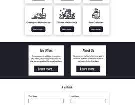
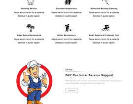
1 building service
2 Caretaker/supervision
3 Glass and building cleaning
4 Green space maintenance
5 Winter maintenance
6 small repairs & craftsmen pool
Furthermore, must be considered topics in the navigation:
- Job offers
- About us
The following elements should be placed on the start page (around 1250 px width):
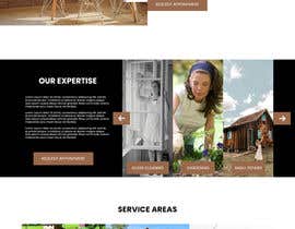
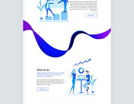
- header image + headline/s plus teaser text
- Logo + navigation + telephone button
- The Eyecatcher(!): 6 main activity areas as (designed like houses (too stupid?)) button (incl. icon (two-coloured 0081ce + #0b3d63 or dark grey) + text + image + logo brand + link/read more) - the elements can be distributed as flip on two sides.
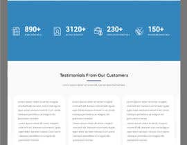
- References (private, medium-sized companies, industrial clients - possible with indication of the total objects, driven distances per week, on the market for 20 years)
- Testimonials (photo, name, text, company name / logo)
- SEO text including headline
- Map (openstreetmap (clean) with almost all objects as rough orientation (like Airbnb maps)
- Job teaser (possibly in the sidebar)
- Arrange a callback (possibly in the sidebar)
- Footer (please not a 4 column (25/25/25/25) link-text-version)
The customer's CD is pretty clean, the typo is also clean. There is a logo and three main colors: #99694b, #0081ce, #a6a6a6. The background should be predominantly white. The continuous text font should be black, the ones on the left #0081c. It would be desirable if the division of the individual areas is not so static as usual, but rather broken up. The "stripe design" is boring. The individual elements do not all have to have the same width. A visual solution for areas of varying widths despite 1250 px limitation would be great.
The used fonts are similar Helvetica normal and Stash Regular. Photos which should be used (old houses with garden around, gardens, workers with garden machines and equipment) and a logo (icon worker and a rectangle incl. the NAME below). As your result I expect a PSD-file in double resolution.
Since I know that not a single one can be great in all disciplines, I would also cut back on the icons. If you can recommend someone you think is better suited for this job, let me know.
I am looking forward to a successful cooperation and a nice product.
PS: As an option the implementation in CSS can be given as a follow-up order.


Post Your Contest Quick and easy

Get Tons of Entries From around the world

Award the best entry Download the files - Easy!
