IT Information Centre branding

  • Status: Closed
  • Prize: £66
  • Entries Received: 29
  • Winner: girmax

Contest Brief

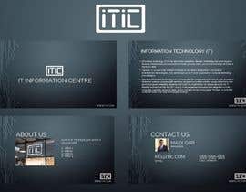
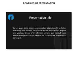
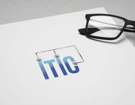
The business name is the IT Information Centre (as per the title of this contest). I need a logo suitable for website, letterheads and business cards. I also want a PowerPoint template (.ppt rather than .pptx - I'm still using Office 2000) which incorporates the logo - this must comprise at least a title master and a normal page master. The business will market to sole traders, partnerships, startups and other small businesses. It will be multi-faceted with its opening activities being data protection advice and consultancy, and an information product about employing Information and Communication Technologies within a small business. The logo needs to work well on white or light coloured backgrounds, such as business cards and printer paper. I will want to use it on both the business's main website and also on subsidiary websites whose titles/ domains differ from the main business's site. Although my target market is very small businesses, I want my branding to convey the impression of a high level of professionalism.
Ideally the logo would be suitable for me to convert to an icon.
Because the logo needs to work on multiple websites, one could argue that it needs to avoid using a name, although I am not convinced either way on this. "IT Information Centre" is arguably rather long for a logo anyway, especially if it is to be converted into an icon. Perhaps use the initials "ITIC"? Or take those initials and maybe rearrange them to form the basis of a graphic logo? The challenge is to come up with something unique that in some form reflects either what the business does or its name (as mentioned above I am not yet convinced one way or the other on the use of the name in some form - thinking about it, plenty of acquisitions end up either adopting or incorporating their new parent company's branding, so it's not as though this approach lacks precedent).
I have just been doing some experimenting with this idea of doing something with the letters - you can see this here:
https://1drv.ms/i/s!An5NzqZYnf0Jqx5YLBqGeuCxML1X
As you can see I had the idea of merging a block version of the letters together and using colour to differentiate each letter from its neighbour, with the colours forming a palette that could be used within a website or PowerPoint master. That idea sounds good in theory but as you can see my attempt looks like something a child would have created. Then I started playing with layering the letters - that looks as though it could perhaps lead somewhere.
This is only an example of one possible way to tackle this - I'm trying to help get ideas going.

Recommended Skills

Employer Feedback

“Maxim clearly read the brief that I gave for the project and his first draft both looked professional and addressed the requirements that I had specified. His turnaround was quick when I suggested changes, and I am delighted with the end result.”

Profile image mbrooks9, United Kingdom.

Top entries from this contest

View More Entries

Public Clarification Board

  • mbrooks9
    Contest Holder
    • 6 years ago

    Everyone, I'd like to thank you for your submissions for this project. I have decided whom to award it to. In the end it was a choice between Maxim G and goway (both of whom proposed logos that I really liked), and I have decided to go for Maxim G. Particular apologies to Mohamed R who was one of the first respondents and did attempt to work with me, but we just didn't quite get there in the end.

    • 6 years ago
  • girmax
    girmax
    • 6 years ago

    #50 new slides for you

    • 6 years ago
  • SoikotDesign
    SoikotDesign
    • 6 years ago

    please check #41 , #42

    • 6 years ago
  • mbrooks9
    Contest Holder
    • 6 years ago

    Wow - where did all these entries suddenly come from? Design G, Maxim G and GOWAY - were you guys all waiting until the last minute to submit (the equivalent of "sniping" on eBay), because I extended the deadline just before your submissions came in. I have to say I am impressed by the quality of what I am seeing from lots of entries now at first glance. I haven't time to examine these and respond in detail just now as I have to go out for the day but I will be back later and respond to each of you then.

    • 6 years ago
    1. DesignGorillaz
      DesignGorillaz
      • 6 years ago

      But see some great designs coming through now and feeling confident you will find just what you are looking for. Your much appreciated interaction on the contest really helps. Many thanks for these and your links, will check them out and submit fresh ideas based on these and you feedback... Many thanks again.

      • 6 years ago
    2. girmax
      girmax
      • 6 years ago

      Thank you for your feed back! I am in proccess. Work with changes you ask. You will wove it!

      • 6 years ago
  • mbrooks9
    Contest Holder
    • 6 years ago

    Folks, for more background information and to help keep the creative juices flowing I have uploaded some examples from a previous company that I ran a few years ago whose logo I was very satisfied with - Pragmatic IT. You will see the logo used as a letterhead and watermark on A4 paper for Word (I don't have any PowerPoint templates from it), and how I was able to create an icon from it. I've also included my old business card just for completeness - it shows how I was able to reuse one of the logo's colours for bordering (I would have used the same colours for header and footer for PowerPoint had I ever needed to). To see these, go to https://1drv.ms/f/s!An5NzqZYnf0Jqx0Klh0T_fd4ka9Z

    • 6 years ago
  • mbrooks9
    Contest Holder
    • 6 years ago

    I have extended the contest by 3 days and increased the prize money a bit as there are a couple of potential winners here which I think are worth exploring further.

    • 6 years ago
  • mbrooks9
    Contest Holder
    • 6 years ago

    I've added more thoughts in the Description and a link to an example of some experiments of my own that I've been doing, just to try and help get ideas flowing.

    • 6 years ago
  • mbrooks9
    Contest Holder
    • 6 years ago

    I have updated the description text to provide greater clarity and guidance.

    • 6 years ago
  • mohmedrashed
    mohmedrashed
    • 6 years ago

    logo name

    • 6 years ago
    1. mbrooks9
      Contest Holder
      • 6 years ago

      I don't think I said that the logo had to include a name. I did say that I wanted to be able to use the logo both on the main website and on subsidiary sites whose titles / domains would differ from the main site's - I would think that this would suggest that a logo that avoids a name might work better, although I am open to suggestions. I'm just an engineer - you guys are the creative ones, so I'm hoping someone can suggest something that fits the brief.

      • 6 years ago
  • mostshirinakter1
    mostshirinakter1
    • 6 years ago

    what your logo name?

    • 6 years ago
    1. mbrooks9
      Contest Holder
      • 6 years ago

      I don't think I said that the logo had to include a name. I did say that I wanted to be able to use the logo both on the main website and on subsidiary sites whose titles / domains would differ from the main site's - I would think that this would suggest that a logo that avoids a name might work better, although I am open to suggestions. I'm just an engineer - you guys are the creative ones, so I'm hoping someone can suggest something that fits the brief.

      • 6 years ago
  • seeratarman
    seeratarman
    • 6 years ago

    #increaseprize

    • 6 years ago

Show more comments

How to get started with contests

  • Post your contest

    Post Your Contest Quick and easy

  • Get tons of entries

    Get Tons of Entries From around the world

  • Award the best entry

    Award the best entry Download the files - Easy!

Post a Contest Now or Join us Today!