Design a Logo for Travel Channel South

  • Status: Closed
  • Prize: €100
  • Entries Received: 152
  • Winner: blackde

Contest Brief

I am about a launch a sales effort towards companies in the travel sector in Iceland. The concept evolves around info-screens that will be placed in lobbies of hotels and guesthouses in the southern part of Iceland. We operate the screens and will sell commercials on them.

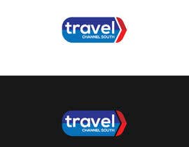
The name of the business concept is Travel Channel South and we are making marketing material for the concept. A part of that is a logo.

The logo needs to ...

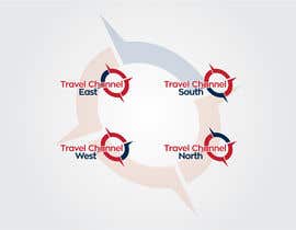
1) Show the name „Travel Channel South“, which implies info for tourists in the south part of Iceland. Later we will make the same business concepts for the East, North and West part of Iceland so it is necessary to bear in mind that we might need, on a later date, similar logos for the other quarters of the country, i.e. East, North and South.

Attached is a basic logo idea, to maybe show what I mean, showing how the word „South“ is made seperate from the first two words.

2) Preferably the logo should be light and attractive and show „movement“ (since this is the travel sector). Also be colorful, but not to much.
3) Use an easily readable font, still smart in design
4) The south part of Iceland has the great Geysir, many waterfalls, the Glacial Lagoon and Thingvellir National Park. Those are all iconic places, that might fit in the logo, maby a cartoon image showing these places. Just an idea.

Later I will make a intro-video with this new logo and to have it run occasionally over the info screens, along with commercials and tourist info. This video will be apprximately 5-7 seconds long and shows the logo fade in (and fade-out), with movement and attractive design. Maybe this needs to be taken into cosideration when designing the logo from scratch.

Recommended Skills

Public Clarification Board

  • firstidea7153
    firstidea7153
    • 5 years ago

    we have spend more than 20 hours for your contest with 28 concepts as per your brief, can you select me as runner up, no one work so hard with quality work. Thank u .

    • 5 years ago
    1. DonRuiz
      DonRuiz
      • 5 years ago

      LOL?!?!?!?!

      • 5 years ago
  • DonRuiz
    DonRuiz
    • 5 years ago

    LOL!

    • 5 years ago
  • bujarluboci
    bujarluboci
    • 5 years ago

    YOU HAVE GOT TO BE KIDDING ME?!?!?!?!!?

    • 5 years ago
    1. Seromendos
      Seromendos
      • 5 years ago

      A CLIENT FROM HELL

      • 5 years ago
  • Seromendos
    Seromendos
    • 5 years ago

    YOU ARE REALLY A CLIENT FROM HELL

    • 5 years ago
  • Seromendos
    Seromendos
    • 5 years ago

    Where is the movement factor you tralked about where is the BLOODY SIHTTY LANDMARKS YOU MENTIONED !

    • 5 years ago
  • Seromendos
    Seromendos
    • 5 years ago

    Is this the winner design ! which isn't orignal it's a simple shitty moucked up logo from google

    • 5 years ago
  • Seromendos
    Seromendos
    • 5 years ago

    WHAT IS THIS SHITT !!

    • 5 years ago
  • cdwdesigns
    cdwdesigns
    • 5 years ago

    Check out my entries

    • 5 years ago
  • cdwdesigns
    cdwdesigns
    • 5 years ago

    Dear Contest Holder ,check #235

    • 5 years ago
  • firstidea7153
    firstidea7153
    • 5 years ago

    hi feedback on designs through chat we provided so much high quality work but no response from you.

    • 5 years ago
    1. firstidea7153
      firstidea7153
      • 5 years ago

      provided colorfull attractive modern logos..

      • 5 years ago
  • TrezaCh2010
    TrezaCh2010
    • 5 years ago

    Hi Sir! Kindly Check my entry #182 #183 #184 #185

    • 5 years ago
  • carluchoo
    carluchoo
    • 5 years ago

    please check #144

    • 5 years ago
  • bujarluboci
    bujarluboci
    • 5 years ago

    Hello there are many components described in the brief do we need to include all of them? also can the logo be in a style of a badge?

    • 5 years ago
    1. bujarluboci
      bujarluboci
      • 5 years ago

      I have included most the symbols that you have written in the brief why only 2 stars? thanks. ( the quality in freelancer shrinks down and has blurry feel to it. can you contact me in chat please i can send much better resolution so you can check it I would really appreciate it. )

      • 5 years ago
    2. firstidea7153
      firstidea7153
      • 5 years ago

      plz fedback through chat box so we can work on. Thank u .

      • 5 years ago
  • AdrianActitud
    AdrianActitud
    • 5 years ago

    Hello, following your idea a bit I designed that logo to represent your company. A minimalist logo, clean, original, simple, different, creative, modern, professional, easy to use and recognize.
    This logo may be used separately or together, your clients will recognize it.
    I hope you like it, please do not forget to leave me your comments and stars. Check #60

    • 5 years ago
    1. Hafsteinn7
      Contest Holder
      • 5 years ago

      Thank your for your suggestion. Your idea does not really stick out to grab the eye. I am looking for something more graphical and colorful.

      • 5 years ago
  • skittofm
    skittofm
    • 5 years ago

    sir please check my #94 - #95

    • 5 years ago
  • carluchoo
    carluchoo
    • 5 years ago

    please check #100 #101

    • 5 years ago
  • mehedibogra880
    mehedibogra880
    • 5 years ago

    sir please check my #99

    • 5 years ago
  • skittofm
    skittofm
    • 5 years ago

    sir please check my #94 - #95

    • 5 years ago
  • bujarluboci
    bujarluboci
    • 5 years ago

    I have included most the symbols that you have written in the brief why only 2 stars? thanks

    • 5 years ago
  • R212D
    R212D
    • 5 years ago

    Check Out #78

    • 5 years ago
  • bujarluboci
    bujarluboci
    • 5 years ago

    Entry #56 Please let me know what you think of this one :)

    • 5 years ago
  • skittofm
    skittofm
    • 5 years ago

    sir please check my #39 - #40

    • 5 years ago
  • Seromendos
    Seromendos
    • 5 years ago

    Kindly check #38

    • 5 years ago
  • Seromendos
    Seromendos
    • 5 years ago

    Kindly check #35

    • 5 years ago
    1. Hafsteinn7
      Contest Holder
      • 5 years ago

      Interesting. Very colorful and lively. Lots of movement. Almost as if there is an earthquake. The most interesting one so far. But it´s a bit "out of balance". I´m gonna wait for other original logo ideas.

      • 5 years ago
    2. Seromendos
      Seromendos
      • 5 years ago

      sir im not copying any ideas from anywhere its original btw im gonna rebalance the logo and make it more tidy thanks for you'r review ^^.

      • 5 years ago
  • Seromendos
    Seromendos
    • 5 years ago

    sir any comments on entry #35 so i can improve ? thanks ^^

    • 5 years ago
  • Designexpert98
    Designexpert98
    • 5 years ago

    sir please check #32 #33 #34

    • 5 years ago
  • Hafsteinn7
    Contest Holder
    • 5 years ago

    I don´t think an airplane should be in the logo.

    • 5 years ago
    1. Seromendos
      Seromendos
      • 5 years ago

      oksy

      • 5 years ago
  • Hafsteinn7
    Contest Holder
    • 5 years ago

    The south part of Iceland has the great Geysir, many waterfalls, the Glacial Lagoon and Thingvellir National Park. Those are all iconic places, that might fit in the logo. Maby a cartoon image showing these places could make the logo jucy. Don´t know. Just an idea.

    • 5 years ago
  • NikeStudio
    NikeStudio
    • 5 years ago

    please check #27 #28 #29 #30 #31

    • 5 years ago
  • Designexpert98
    Designexpert98
    • 5 years ago

    sir please check my entry #12 #13 #14 #15 #16 #17 #18 #19 #21

    • 5 years ago
  • Hafsteinn7
    Contest Holder
    • 5 years ago

    This is much to boxed. Needs to be more light and fun. This is for a service in tourism.

    • 5 years ago

Show more comments

How to get started with contests

  • Post your contest

    Post Your Contest Quick and easy

  • Get tons of entries

    Get Tons of Entries From around the world

  • Award the best entry

    Award the best entry Download the files - Easy!

Post a Contest Now or Join us Today!